


Working with React Components + Props
A summary of making your components simple and Better (React)


What are props?
In simple terms, they are data passed into components.
When to use props?
When building a react application, the UI is divided into smaller parts called Components.
Some of these components are re-used in various pages or parts of the application, of course with different data/messages/content. For this to be effective, props are used.
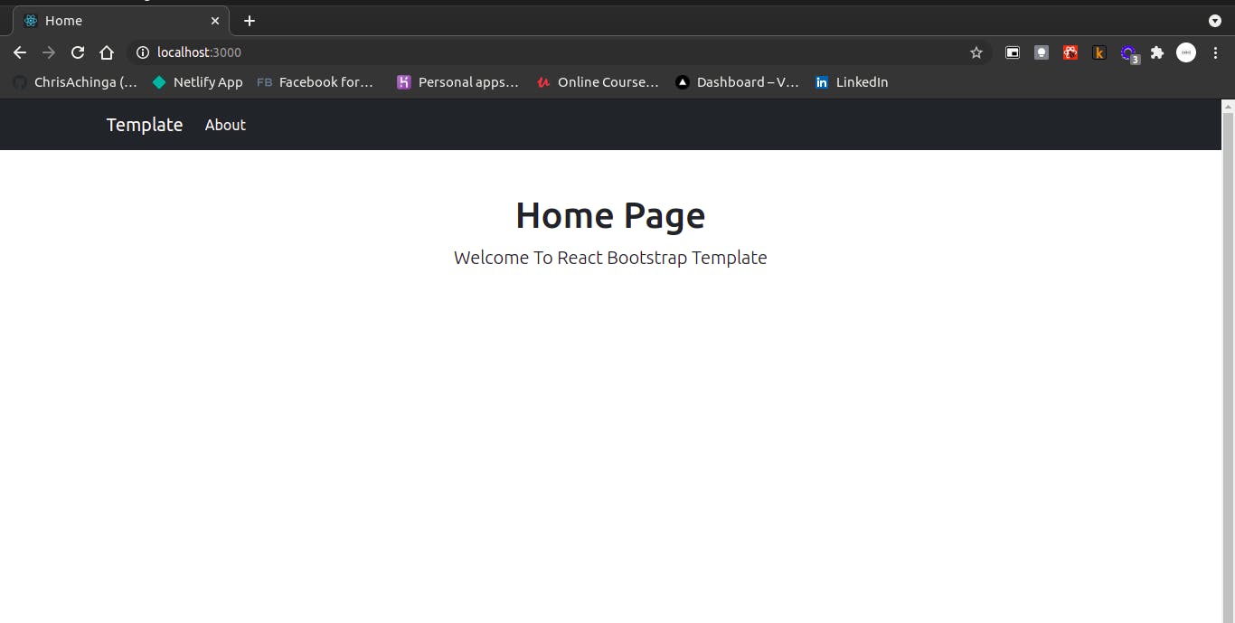
For example, a simple react website with two pages, all share a common <Head> element:
Home page
About page
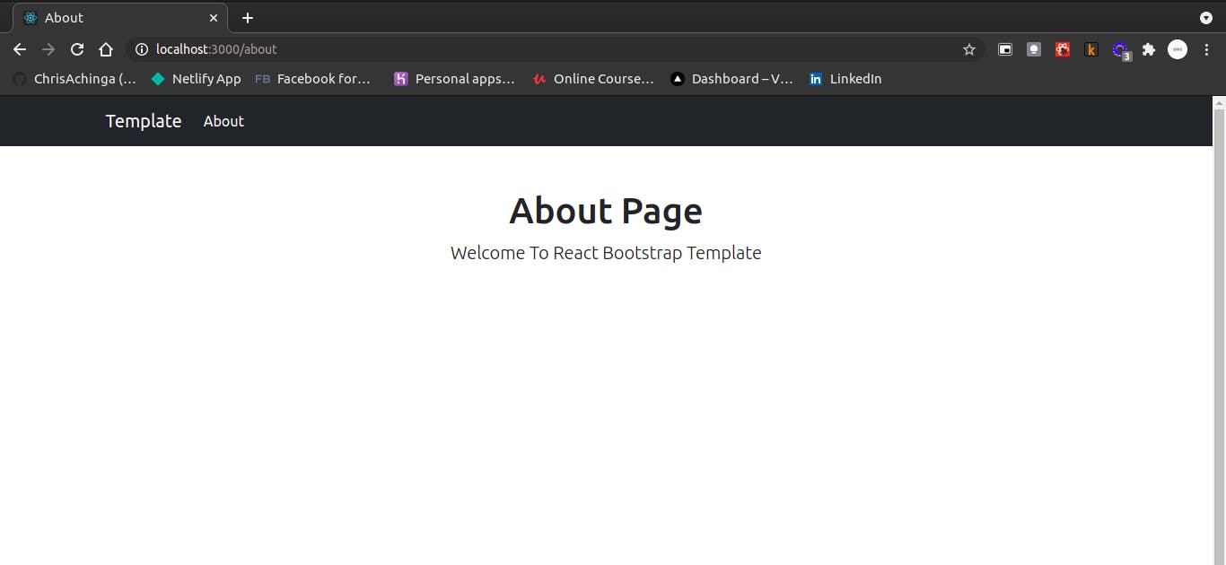
The two pages share a common <Header /> component:
const Header = ({ head, description }) => {
  return (
    <>
      <div className='starter-template text-center mt-5'>
        <h1>{head} Page</h1>
        <p className='lead text-capitalize'>{description}</p>
      </div>
    </>
  )
}
(Don't worry, I'll explain the code 😄 here)
Creating a Prop
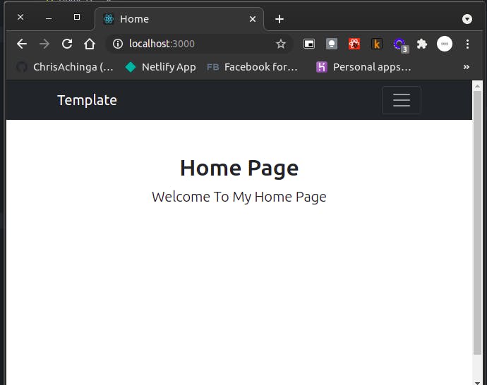
Consider a sample component below:
const Header = () => {
  return (
    <>
      <div className='starter-template text-center mt-5'>
        <h1>Home Page</h1>
        <p className='lead text-capitalize'>Welcome To My Home Page</p>
      </div>
    </>
  )
}
The component can be re-used by simply importing it to the page/file and using <Header />. The expected results will be:
Imagine having an application with more than one page, you'd have to write a header component for every page. That shouldn't be the case. Use Props! 😄😄
To be able to re-use the <h1>Home Page</h1> and <p className='lead text-capitalize'>Welcome To My Home Page</p> with different content in each page, we'll simply pass in props:
const Header = (props) => {
  return (
    <>
      <div className='starter-template text-center mt-5'>
        <h1>{props.title} Page</h1>
        <p className='lead text-capitalize'>{props.description}</p>
      </div>
    </>
  )
}
We declared props as an argument in the function components, and replaced the contents in the <h1> and <p> elements to use the props. The values replaced, i.e {props.title} and {props.description} will be used to pass in data dynamically wherever the Header component will be used.
On the page where you'll be using the component, you'll simply add attributes to the component: For example on the home page:
<Header title='Home' description='This is the Home page' />
destructuring
The New es6 features allows destructuring of props in the components:
const Header = ({ title, description }) => {
  return (
    <>
      <div className='starter-template text-center mt-5'>
        <h1>{title} Page</h1>
        <p className='lead text-capitalize'>{description}</p>
      </div>
    </>
  )
}
Defualt Prop values:
Documentation - Declaring default props
For some reason you may forget to pass in a prop value or something fishy happens in your application. You may want to set up a default prop value to cover up for that.
To do that you simply add:
Header.defaultProps = {
  title: 'Page Title',
  description: 'A defualt description',
}
This will ensure that your components always have data passed in incase something fishy happens.
Props Typechecking
As your app grows, you can catch a lot of bugs with type-checking.
Documentations - Typechecking with prototypes
To perform this, you have to import prop-type into your components.
import PropTypes from 'prop-types';
Header.propTypes = {
  title: PropTypes.string
};
You can set a default data-type for a prop with the available options:
// You can declare that a prop is a specific JS type. By default, these
  // are all optional.
  optionalArray: PropTypes.array,
  optionalBool: PropTypes.bool,
  optionalFunc: PropTypes.func,
  optionalNumber: PropTypes.number,
  optionalObject: PropTypes.object,
  optionalString: PropTypes.string,
  optionalSymbol: PropTypes.symbol,

  // Anything that can be rendered: numbers, strings, elements or an array
  // (or fragment) containing these types.
  optionalNode: PropTypes.node,

  // A React element.
  optionalElement: PropTypes.element,

  // A React element type (ie. MyComponent).
  optionalElementType: PropTypes.elementType,

  // You can also declare that a prop is an instance of a class. This uses
  // JS's instanceof operator.
  optionalMessage: PropTypes.instanceOf(Message),

  // You can ensure that your prop is limited to specific values by treating
  // it as an enum.
  optionalEnum: PropTypes.oneOf(['News', 'Photos']),

  // An object that could be one of many types
  optionalUnion: PropTypes.oneOfType([
    PropTypes.string,
    PropTypes.number,
    PropTypes.instanceOf(Message)
  ]),

  // An array of a certain type
  optionalArrayOf: PropTypes.arrayOf(PropTypes.number),

  // An object with property values of a certain type
  optionalObjectOf: PropTypes.objectOf(PropTypes.number),

  // An object taking on a particular shape
  optionalObjectWithShape: PropTypes.shape({
    color: PropTypes.string,
    fontSize: PropTypes.number
  }),

  // An object with warnings on extra properties
  optionalObjectWithStrictShape: PropTypes.exact({
    name: PropTypes.string,
    quantity: PropTypes.number
  }),

  // You can chain any of the above with `isRequired` to make sure a warning
  // is shown if the prop isn't provided.
  requiredFunc: PropTypes.func.isRequired,

  // A required value of any data type
  requiredAny: PropTypes.any.isRequired,
That's all
reactjs.org/docs/components-and-props.html
reactjs.org/docs/typechecking-with-proptype..
Written with 💜 by Chris Achinga
#2Articles1Week